A Plateau, A Cliff, and Physics Walk Into a Switch Bar
This short article is aimed at being a follow up on a recent full-length article of mine titled ‘On Differences In Linear Switches’, though I realize that reading an extra, wildly different article on top of the other short already released today might be a bit more than most people are in for. So, rather than pointing you back to a third article to have to read in addition to everything else, let me briefly summarize what that article was about and what I’m writing about here today. After hearing people complain that all linear switches are “basically the same as one another” for year after year, I decided to seek out a way to quantify the differences that do exist between linear switches using the force curve repository that I had slowly been building over time. In that article, I debuted two new, different categories by which I think everyone can and should separate their linear switches – ‘slope’ and ‘linearity’. Slope is the term used to refer to the rate of change of force over the linear portion of a switch’s downstroke and is discussed on a scale from flat (low gf/mm) to steep (high gf/mm). Linearity, on the other hand, effectively describes how straight the linear portion of the downstroke in a linear switch is. Based on the R^2 ‘best fit’ parameter generated from linear regressions, linearity is discussed on a scale from wavy (R^2 ≈ 0) to straight (R^2 ≈ 1.000). Since the debut of this article, I’ve not only been collecting and generating more of this linearity data, but have also pushed it into full length reviews of linear switches as you can see below!
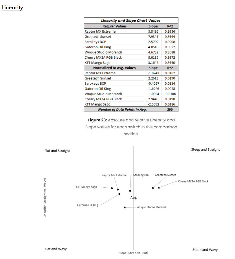
Figure 1: As seen at the bottom of the comparisons section in the Raptor MX Extreme Switch Review!
All of the numerical and graphical data seen above in the Raptor MX Extreme Switch Review is, like all other data that I collect and display as part of my reviews, available via the ‘Switch Measurement’ or ‘Force Curve Repository’ links under the ‘Archive’ tab of this website. However, I still am sensing a bit of confusion about those numbers and plot above for those of you who didn’t read the ‘On Differences In Linear Switches’ article. Since these are the two metrics I’ve aimed to quantify linear switches with, I figured it would be neat to compare switches by assigning the slope to an x-coordinate and the linearity to a y-coordinate and then plotting them altogether on their plot centered around the “average” value of each of these. Since a switch being “steeper” or “flatter” is almost always used as a relative comparison term when discussing two different switches, I’ve chosen to represent and plot all of linearity and slope values for switches as normalized to the average slope and R^2 value of all switches measured thus far rather than their absolute, measured values. While this won’t change the shape of the graph nor the way that the data is represented, it makes it much easier to definitively make comparisons between many different switches plotted on the same plot. For the sake of this article, though, I don’t just want to plot one or small handful of these switches. Instead, I’m interested in sharing my thoughts on two odd features in particular that I noted when you do something like plot the 406 different switches that I’ve calculated slope and linearity on thus far.

Figure 2: Qualitative linearity and slope plot of all 406 force curves analyzed to date.
I can imagine that at least a few of you are immediately as perplexed upon seeing that spread of data as I was when I first plotted it all out myself. I’m not entirely sure what I expected, sure, but I definitely didn’t expect a sort of ‘boomerang’ shape to how slope and linearity would plot out over several hundred linear switches. Despite my best efforts, as well, I’ve not found any data processing technique or representation scheme that helps spread this data out and/or presents it in any more of a coherent fashion, either. Though throughout my hours of attempting such, I’ve begun to think more about the premise that these points are lying in this fashion not because of an artifact of how the data was created or represented here, but rather because of some underlying physical reasons. Perhaps this odd boomerang shape to this linearity plot is pointing to a pair of physical limitations that are actually baked into the physics of how switches and their components work under normal use cases. Here’s my thoughts as to these two physical limitations that are bending linear switches into this weird pattern:
#1 - The ‘Damn Straight Plateau’

Figure 3: Qualitative linearity and slope plot of 406 force curves with the 'Damn Straight Plateau' labeled.
Irrespective of your personal preferences about using linear switches in builds, you’d be hard pressed to argue that linear switches aren’t pretty good at just simply being linear. Largely driven by their spring which holds the stem in place and helps push it back to rest after every keystroke, the majority of the force in any linear switch exists perfectly up and down its central vertical axis. Sure, there are some side-to-side forces that do pop up between the stem legs and leaves in traditional MX-style switches or when switch stems are wobbly, though they play a very small role in the overall force experienced by a linear switch. As a result of this, the force curves for most of these linear switches tend to be quite straight and only affected by their (Hookean) springs – a result which is what directly leads to the flat top to the data that I’ve affectionally referred to as the ‘Damn Straight Plateau’. In fact, of the 406 force curves which are represented on this plot, 239 of them (or 59% rounded up) have absolute R^2 values greater than 0.9900 a value which is pretty impressive when you consider that Excel would consider 0.9999 to be effectively perfectly straight. (By comparison, there are only 11 total force curves of those 406, or 2.8%, which have an absolute R^2 beyond 0.9990.) Due to how these values are calculated and how basic math and physics works, it doesn’t seem as if we can or will be breaking out beyond this plateau any time soon. However, that does not mean that this is all there is to extract out of this seemingly straight line upper bound to linearity.
As I was working on the data collection for this article, I spent an embarrassingly long time just staring at the plot above and swearing up and down that the plateau wasn’t nearly as straight as it seems. As you move from the flatter switches at the far left end of the plateau all the way to the Cherry MX Hirose White on the far extreme right hand side of the plot with its absolute slope of 15.2 gf/mm and absolute R^2 of 0.9989, I could swear there is just the faintest of inclines. After having finally worked up the courage to take the several minutes to make a plot to determine if my eyesight was finally going bad, I was surprised to find that I wasn’t actually wrong on this one, for once. Stripping away all of the data points for switches that have absolute R^2 values less than 0.9900 and then plotting a line of best fit through them, it does appear that there is a slight upward trend in these data points that you can see below in Figure 4. Never mind the fact that the R^2 value for this plot is extremely low, that three ten-thousandths of a point of slope is important to me!
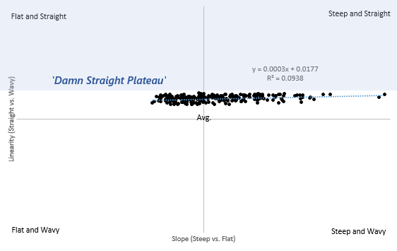
Figure 4: Truncated linearity and slope plot keeping only force curves with absolute R^2 values greater than 0.9900.
On the surface, this trend (as weak as it is) seems to suggest that switches with steeper increases in their force across a downstroke also happen to have slightly straighter force curves. As I sat and chewed on this a bit further, I actually came to the realization that this conceptually makes more sense than it may seem at first. Anecdotally, switches with steeper force curves tend to be ones which span a wider range of force from the start of their downstroke to their bottoming out, often leading to them to start at an average point and reach into a ‘high’ spring weight value at bottom out. Very rarely have I ever seen a linear switch that jumps up more than a handful of grams of force over its downstroke when it initially starts out at values below a medium starting weight around 50 gf, or so. The steeper switches I have seen often start at or above this 50 gf initiating force and then climb at double digit gf/mm slopes to reach in excess of 100 gf at bottoming out. Thus, if this anecdote is actually grounded in reality, these steeper switches should generally have bottom out weights which are higher than the flatter switches on average. It just so happens that I got lucky twice in a row in this train of thought, and as can be seen below in Figure 5, there’s a pretty strong correlation that does exist between the bottom out weight and slope of linear switches!

Figure 5: Oh shit, will you look at that...
Thinking all the way back to the force vector concept that I started out the beginning of this section with, this tenuous connection between heavily weighted linear switches, steep slopes, and straight force curves actually resolves itself quite nicely. Since the total force vector of a linear switch is primarily straight up and down because of the average spring weight being much stronger than the side to side forces of switch leaves or stem wobble, it makes sense that heavier springs which push more in that up and down direction would better ‘drown out’ the small forces generated in the side to side directions than lighter springs. Since heavier springs used in keyboard switches tend to be ones which have a steep linear increase in force as the stem is pushed in more based on the above, these steeper values also then become directly linked to ones which are straighter than not. As a result, the force curves of heavier linear switches are practically done with steeper slopes that are mechanically less influenced by minor internal forces and physically result in true, straight-line behavior predicted by Hooke’s Law for the springs inside of them. Extrapolating out a bit further, these trends also seem to suggest that the most likely chance we stand of ever getting to a “perfectly straight” linear with an R^2 of 0.9999 or greater would be in a linear with a steeply increasing spring that bottoms out well in excess of 120 or even 130 grams of force.
#2 - The ‘Decently Flat Cliff’
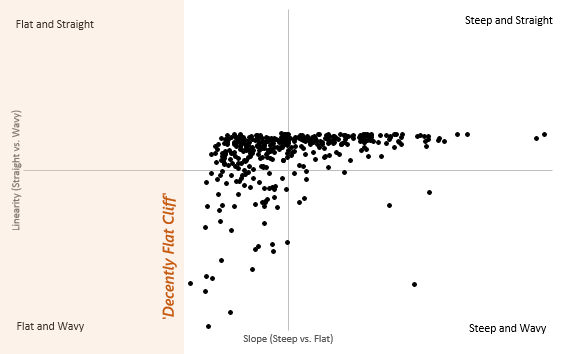
Figure 6: Qualitative linearity and slope plot of 406 force curves with the 'Decently Flat Cliff' labeled.
Moving away from the steepest of linear switches and towards the left end of the data plotted above, there is another weird asymptote that is approached by the seemingly absolute flattest of switches. Vertical rather than horizontal, this ‘Decently Flat Cliff’ is dotted with switches that have the absolute least change of force between the start of their downstroke and bottoming out, and thus feel almost exactly the same from start to finish. Whereas the ‘Damn Straight Plateau’ up at the top was approached by more than half of the force curves plotted here, this cliff seems to be a much more rare thing to brush up against, with only 19 of the 406 total force curves (4.7%) coming near this cliff with a slope that is less than half of the overall average at 5.44 gf/mm. Surprisingly, though, I don’t think that the Decently Flat Cliff takes nearly as much effort to explain as some of the weird patterns and trends that I noted in the Damn Straight Plateau. In fact, all it takes is for us to lean a little bit more further into Hooke’s Law for springs.
To again reference everyone’s favorite introductory physics equation, we know from Hooke’s Law that the force that an ideal spring exerts is directly proportional to two things – the distance that it is push in and a ‘spring constant’ that is inherent to the spring itself. In any given ‘steep’ keyboard switch, the spring constant of that spring must be pretty high so that the smallest compression leads to the biggest change of force. Here at the Decently Flat Cliff, though, these switches are built with springs that have quite small spring constants, which lead to their force not changing much at all over any amount of compression. As you get closer to the imaginary vertical asymptote that I’ve dubbed the DFC, you’re effectively approaching a hypothetical switch that is built with a spring that is getting closer and closer to a spring constant of zero. (Mind you that we will never actually reach this asymptote as it is impossible for a spring to have a spring constant of zero and still function as a spring.) Much like with the Damn Straight Plateau, the switch force curve data processed here seem to point to a physical limitation of switches themselves, meaning that we will realistically never find a math- or physics-breaking switch that steps beyond this point. That is, assuming I don’t make any sort of weird measurement errors on my part.
Interestingly, as we go over this Decently Flat Cliff, we also see a substantial uptick in the number of switches which have ‘wavy’ linear regions in their downstrokes as opposed to ‘straight’ ones. Thinking back one last time to the final paragraph of the Damn Straight Plateau section, we know that springs with heavier bottom out weights tend to be steeper and produce much more force vertically than any sort of side to side forces that could impact their overall force curve. On the opposite side of this coin, when springs don’t have all that much force change in the vertical direction as they are compressed, they are much more susceptible to these side-to-side forces caused by mold intolerances or stem-leaf interactions. As a result, the increased impact of these non-vertical forces is what leads to the sporadic rises and dips in the downstroke force curve of these switches, giving them a wavy appearance. Whether this translates into an actual in hand feeling, though, is entirely up for debate. Irrespective of the impact that ‘straight’ or ‘wavy’ downstrokes have in linear switches, I still think that it’s neat that we do have some understanding of why these phenomena occur in linear switches. And so with both the Damn Straight Plateau and Decently Flat Cliff thoroughly beaten to a horse paste over this article, I can present the final graph of this data with these physical limitations as I’ve understood it thus far. In the meantime, I’ll leave you to chew on the implications of this and to begin asking questions about some of those weird, nebulous outliers that really stand apart from these two regions…

Figure 7: Qualitative linearity and slope plot with combined physical interpretations from this article.