Odd Switch Short II: TTC Venus/Neptune
There’s not a single current switch manufacturing house that makes housing designs as striking and intricate as TTC does. You heard me. Many people may initially be taken aback by such a bold claim and consider some of those glittery style housings from Durock/JWK or even interesting color palettes of up-and-coming manufacturers as the peaks of housing design, although those people would be wrong. TTC is not just the brand of light weight linear dustproof switches, or OEM style offerings of Red, Brown, and Blue switches in varying degrees of orange – they’ve had quite a few unique housing design iterations over the past handful of years. On the more mild side, we have switches such as the Helix Lab x TTC Skylars and Reymo Aces which feature inscriptions on the north side of the top housings something only ever seen prior in Cherry MX Side-Stamped Blues. On the more wild side, recent designs such as TTC Camos and the serialized OG Rabbits and Tigers for Lunar New Year releases have really pushed the boundaries of what was once thought possible in the MX switch footprint. However, amongst all of the intricate details inside and out of these fancy TTC releases over the years, I’d be willing to argue that none of them really hold a candle to the mashup of intricate design and performance that a pair of under the radar releases from a few months ago – TTC Venus and Neptune – have.
Figure 1: Group of innovative TTC switches including OG Tiger, Helix Lab Skylar, OG Rabbit, Love, and Venus.
At first glance, the Venus and Neptune switches hardly strike as resoundingly innovative. Fully foreshadowing the fact that the innovation is purely internal, that is not to say thought that the exteriors definitely don’t look unique. Featuring a significantly more rounded, flattened, and pancake-like design to the top housings, these switches have been fairly readily compared to UFO-like spacecraft in their appearances, with a softened LED condenser in the front to boot. While I have no good answer as to why exactly these housings are shaped in this fashion, immediate comparisons to traditionally shaped MX-style switches side by side show the housings of the Venus and Neptune switches to have a much more narrow top profile and steeper sides than the more bulky, sharper walls of traditional designs. If I had to wager a guess that this was intentional in design and not just an aesthetic choice on TTC’s part, it would seem to me that this reduced under-keycap profile and steeper walls would help prevent interference with keycaps being pressed in that may collide with switch housings. It’s also worth keeping in mind here that this makes sense considering TTC is a primarily eastern facing company that sells switches to eastern markets, as they much more often use PCB layouts with north facing switches that have the nameplate region facing the user and more likely to interfere with certain keycap designs.
Figure 2: TTC Neptune top housing external design showing large slot for LED condenser and flattened, 'pancake' style housing exterior.
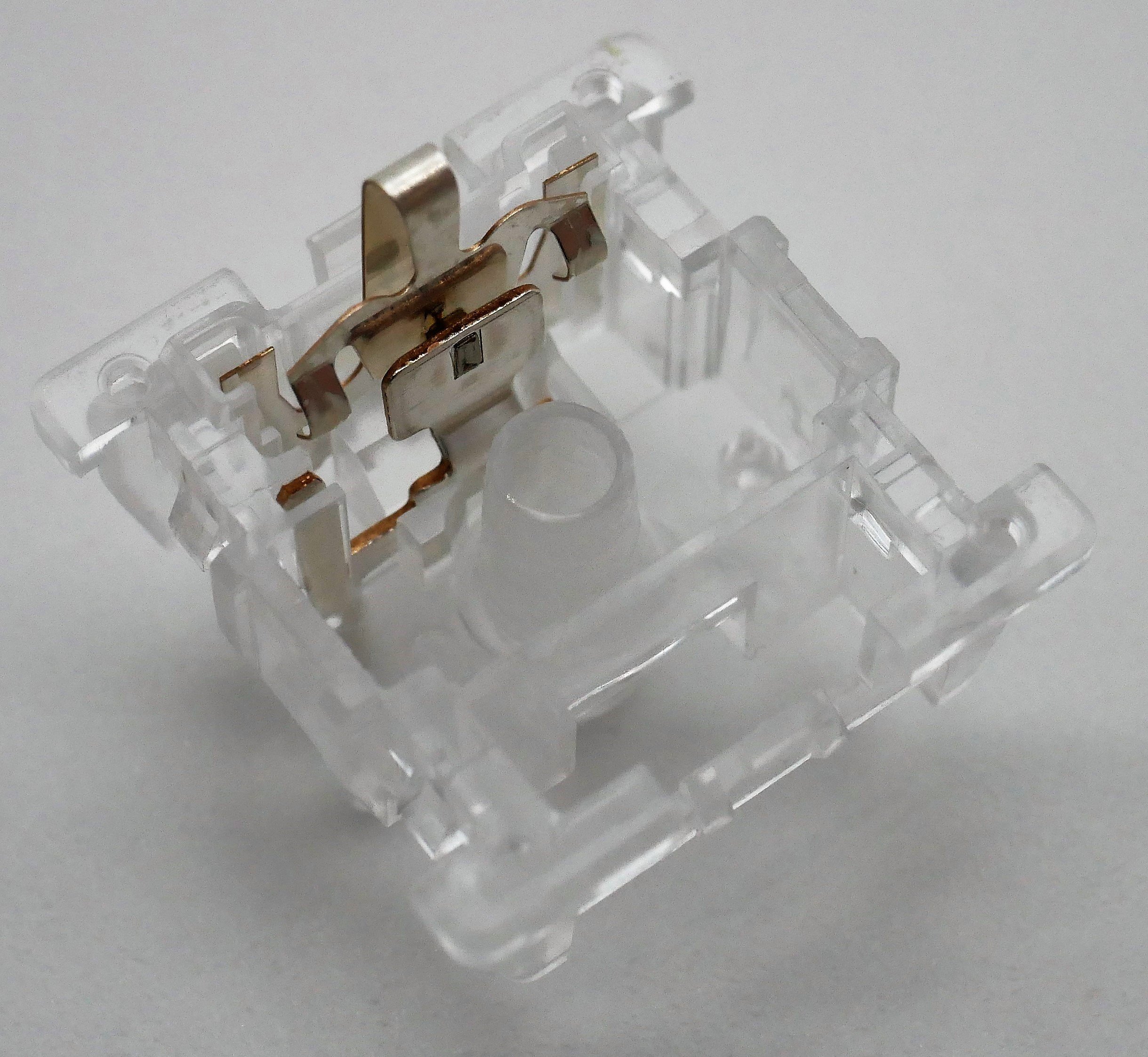
The real kicker in the design of these two switches, though, comes on the inside of the top housings. Rather than having a traditional looking interior, on closer inspection we see that the slide rails that are normally mounted in the bottom housings of a switch are actually mounted to the top housing instead. But Goat, I thought you said this was innovative – there’s other switches out there that have this? While it is true that there’s a rare few modern MX-style switches which have this design feature, and a slightly uncommon MX-adjacent switch in Taiwan Jet Axes which also have top housing mounted slider rails, the execution of performance with this design is absolutely unmatched in the TTC Neptunes and Venuses. As pointed out in my scorecard for the TTC Neptunes, the incredible lack of stem wobble as well as the nearly perfected amount of factory lubrication makes these not only the best of this style of switch design, but also an incredible demonstration of just how good alternative MX-style switch designs can be. The fact that these nearly perfect out of the box switches haven’t caught on into the consciousness of the community at large is quite a shame both for them as well as TTC, who could easily be making these flagship offerings moving forward. While I thought I already did more than enough with my scorecard alone, I simply couldn’t let the designs of these slip under the radar without taking at least a few good photos of them. It’s a shame I never got enough to do a full review of either…
Figure 3: TTC Neptune top housing interior design showing affixed slider rails and associated unique architecture.
Figure 4: Top housings with sliders as found in Taiwan Jet Axis Yellows (Left) and TTC Neptunes (Right).
Figure 5: Bottom housing interior of TTC Neptune switches showing entirely silvered leaves as well as large gap where the slider rail sits. Do note that the circular feature seen at the bottom of the slider rails is actually the PCB mounting pin on the exterior.


